Friday, December 16, 2011
From Communism to Democracy
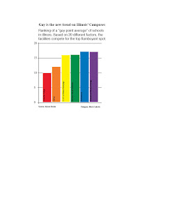
Gay Point Average

Bright Lights, Dark Streets
Working on this project was extremely fun. It pushed me to go out of my comfort zone which is typical newspaper style layouts, and into the world of websites. I struggled in a creative sense because I did not know how I wanted the website to come out. Because the story was talking about the dirty streets in New York City, particularly Times Square, I decided to go with the black background and some splashes of yellow to portray the night. The night was supposed to compare the darkness between the sun setting and the garbage on the streets.
Tuesday, October 25, 2011
Restoration to it's finest
This project was very fun and exciting. I always liked how people restored photos but I never knew how they did them. Once I got the hang of photoshop, it became very easy. The trickiest part of the project was zooming in and finding all of the little holes and smudges that should be photoshoped.
I used tools on photoshop such as lasso, brush, spot healing brush and stamp. Each of these tools allowed me to alter the picture to make it look original. One of the things I struggled with a lot was the green part by her head. I have no idea what that is or if it should be altered. Other than that, the project was a blast and now I can alter my own photos from decades ago.
Tuesday, October 11, 2011
Feels like you're looking at the same thing, right?
For this project, I had to remake a page from an April 2011 Esquire issue. We didn't have to find the same exact photos as in the original document, but we had to find something as close as possible to the images. Some of the strokes I couldn't find on InDesign, but this is what I came up with.
The hardest part of the project was paying attention to all of the little details. For example, I had to separate the text from the images and the borders at an exact length. Also, It was really hard to find images that remotely resemble the original photos. Once they were found, tweaking them to look like the originals was a task not easily done.
Sunday, September 25, 2011
Clear target
The description should be the same as for the black and white image but the colors on these images are both cool and warm. They are supposed to give a sensation to the image. For the warm colors, it shows anger at the current political structure and it calls for action. The cool colors on the other hand are supposed to portray a relaxed situation. The reason I put the cool colors first is because it portrays a "calm before the storm."
Tuesday, September 20, 2011
Political struggle to reach the target
This composition tries to illustrate the struggle to reach the target. The black and gray colors of the rectangles and circles represent struggle and oppression to reach the top while the black target in the middle shows that even when the target is reached, it's not much different from the journey.
Subscribe to:
Comments (Atom)


